Accessibility Review
"Although the new WhiteHouse.gov is still in its initial stages, we are constantly updating our site in an attempt to make it as accessible as possible. To improve the accessibility of WhiteHouse.gov, the White House has asked users with disabilities to review the site and has also reviewed the site's accessibility with outside web tools. The results of these reviews have been incorporated into the website. The White House welcomes comments on how to improve the site's accessibility for users with disabilities. "
Let's make it a shining example of what can be done when you care!
Skip links, keyboard tab to links, and home image links
Skip links are hidden from view. There should be an on screen indication that the skip link is available to help navigate to footer and content. Since keyboard or other input device users who are sighted could benefit from the skip nav link, it should show up. If this will ruin the design, then at least use the a:hover state with on screen position to expose the link to all assistive technology, keyboard and other users who could benefit from quick way to access the content and other links. It would be nice to have a skip to navigation as well as skip to content. On inside pages the skip to main content actually starts with the subnavigation list instead of the actual article heading. The anchor should be at the start of the first heading of the actual paragraph content for the page.

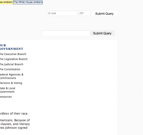
Images that are links to the home page should have alt text that says something like “to home page.” 4 images on every page link to the home page and have a variety of alt text. Probably only the first one needs to have alt text, the rest could have empty alt tag.
/images/eop/clear.gif
alt="The White House - President Barack Obama"
/images/eop/clear.gif
alt="The White House emblem"
/images/eop/hdr-usa-flag.gif
alt="Flag of the United States of America"a
alt=www.whitehouse.gov
alt="The White House - President Barack Obama"
Restore hover states for links. It is good to see where your cursor is if using keyboard navigation.
Page Load
526 KB is pretty large for average user and more so for computers using assistive technology. Even though less than 100 kb is probably to small to ask of this high profile site, it should be much closer to this.
Images: pretty big! 26 requests, 443kb without the javascript slideshow extra image loads. http://www.whitehouse.gov/assets//hero/YWA_Hero_HL.jpg, a background image, is 115kb and loads 3 times for the javascript show. It could be compressed a lot smaller or even just replaced with a background color, without too much impact to the nice design. It is a bigger file than the foreground feature images!
images/eop/bg-main-one.jpg is one large background (48kb, 1280 x 1280 px) used primarily for two small page elements, that could be better incorporated with separate smaller images (header and seal) and a background gradient repeating slice.
61 kb in javascript, some is not used on the home page
Structure, readability and content
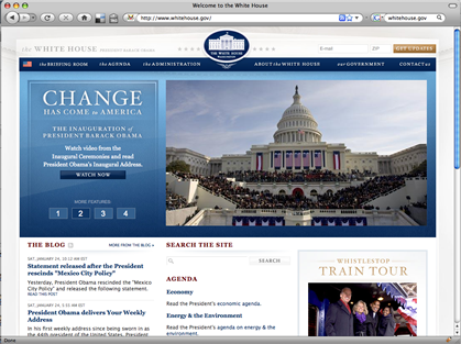
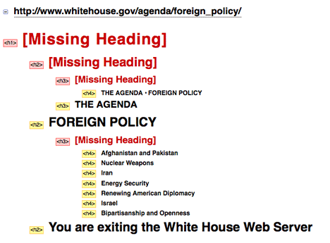
Outline headings use for main headers in logical order on home page. However inside pages do not have the same attention to detail.
Content is fairly dense. Use of line-height to open paragraphs would provie easier readability. Bullets are used in some sections, but could be used more. Flesch-Kincaid reading grade level scores of 12 - 18 on several sampled pages, means visitors would require reading level of high school to college graduate. Hurry and add material targeted specifically to children. Two slideshows and dull facts list are not enough content for a very popular website for school children.
http://www.whitehouse.gov/briefing_room/nominations_and_appointments/
Add some links to their bios and information about who they are, photos, etc!
Text navigation images, text resize, color and contrast
The text colors for many areas that do not provide enough contrast make the site inaccessible to users with impaired vision. Sufficient contrast in not provided with the gray text on the background image throughout much of the site, but especially in the footer area where the background image is visible and also light gray. The date for stories and the alt text for the featured images are also not passing contrast validation.
With images turned off, but with css on the navigation text is off screen. Rollovers still work, so flashes of drop down text appear if the user happens to mouse over the missing images. 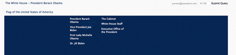
If text is resized in browsers that only increase text and do not “zoom” the whole page layout, the main slideshow area grows and overlaps the text area below overlapping and jumbling visual content, especially when descriptions are longer.
This is true for text in the drop downs also, there is no background color to fill in the space around the small image when text is enlarged and breaks the layout.
The navigation bar is image based and fairly small point text which is unfriendly to users with visual impairments or aging eyes.
Navigation
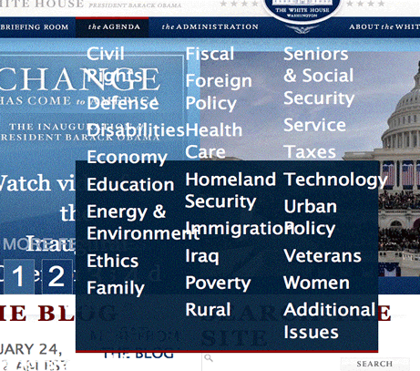
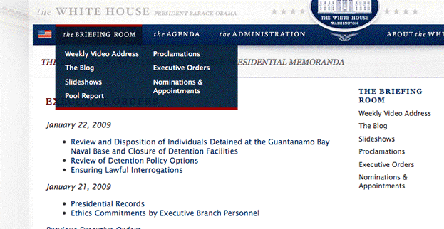
Nice sub-navigation design on inside page, repeating links to other parts of the section that are in rollover drop down.
Each section "button" is an active link to a list of the subsection pages, so even if unable to get the drop down links, the link on the navigation bar will take the user to the content from a subsequent landing page.
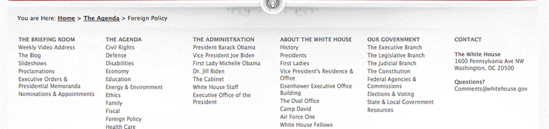
Nice use of footer to provide site index in text links and makes links available that might have been a problem in top navigation depending on browser text and image settings.
Whitehouse pool report has none of the top persistent navigation except for the White House icon to go back to home page. http://www.whitehouse.gov/pool/
Images and alternate text
Sidebar images which provide links to promoted sections of the site do not have alt text because they are background images on the <a href> tag. At a minimum the <a href> tag should have a title describing the link. Better would be to provide an actual inline image with alt text, or at least a inline clear spacer image as was done in the masthead with alt text. There is a title on the div, but if screen reader is doing link list these will only read the a href URL. There is quite a bit of text in the image for sighted viewers that is lost to blind users.
Multimedia
Big points for videos with captions, some with alternate mp4 files and transcripts! http://www.whitehouse.gov/president-obama-delivers-your-weekly-address/
I could not get the YouTube Flash video interface to play with keyboard controls, but was able to download the mp4 version and play in quicktime (it took mp4 forever to load since it is a higher quality version).
Lose the “watch here” link and use a meaningful text link (date at least, but short title would be better) to specific video’s page (since there are bound to be more links on this page and we don’t want all links to be “watch here”) http://www.whitehouse.gov/weekly_address/
I can’t control the Presidents or Pets slide shows with keyboard navigation. Can’t activate pause, which is only a div with cursor styling added. "Slideshow info" has no hover state either so it's hard to know that I actually can activate the show/hide info with keyboard http://www.whitehouse.gov/slideshows/presidents/
Forms
Why is whole home page in a form tag? This could seriously confuse a screenreader user. If the user thinks they need to be in forms mode, in order to interact with form elements, all the content that is not a form element is not being read.
http://www.whitehouse.gov/contact/
The contact form uses table cells and rows to layout the form. Input fields are in one row and identifying text for the input is in the row after the input fields. No label tags are used to match field name to input fields, which is extremely important in this table structure. No machine readable indication of required fields is available (star is a visual, background image only, no alt text available)

Javascript
The search form does not work with javascript off, a serious problem that should be fixed ASAP. It actually goes to the contact form instead of providing any search results. Many users of assistive technology have javascript off since it often interfers with their software. These same users rely on search to quickly get to the content they want .
Clicking on the "next" link in search results often delivered the message "Search was unable to find any results for children, you may have typed your word incorrectly, have entered an empty phrase or are being too specific." Page number links work.
The slideshows nicely provided thumbnails and large photos without javascript in a simple list, although they were positioned too far down (below the normal slideshow area).